

The internet bank’s home page offered very little functionality and had gradually turned into a product showcase. Users could not quickly access essential banking operations, so many key scenarios shifted to the mobile app. Our goal was to turn the web version into a fully functional standalone channel and increase the use of its core features and products
This problem was even more noticeable on mobile web. The experience was inconvenient, and users often switched to the app to complete basic tasks


What we saw at the start
few customers used the online bank compared with other channels
mobile users struggled to complete key journeys after arriving from external channels
the mobile web experience received a lot of negative feedback
the home page was mostly static and offered very few useful actions
design files were hard to navigate, and there was no clear design process
Task statement
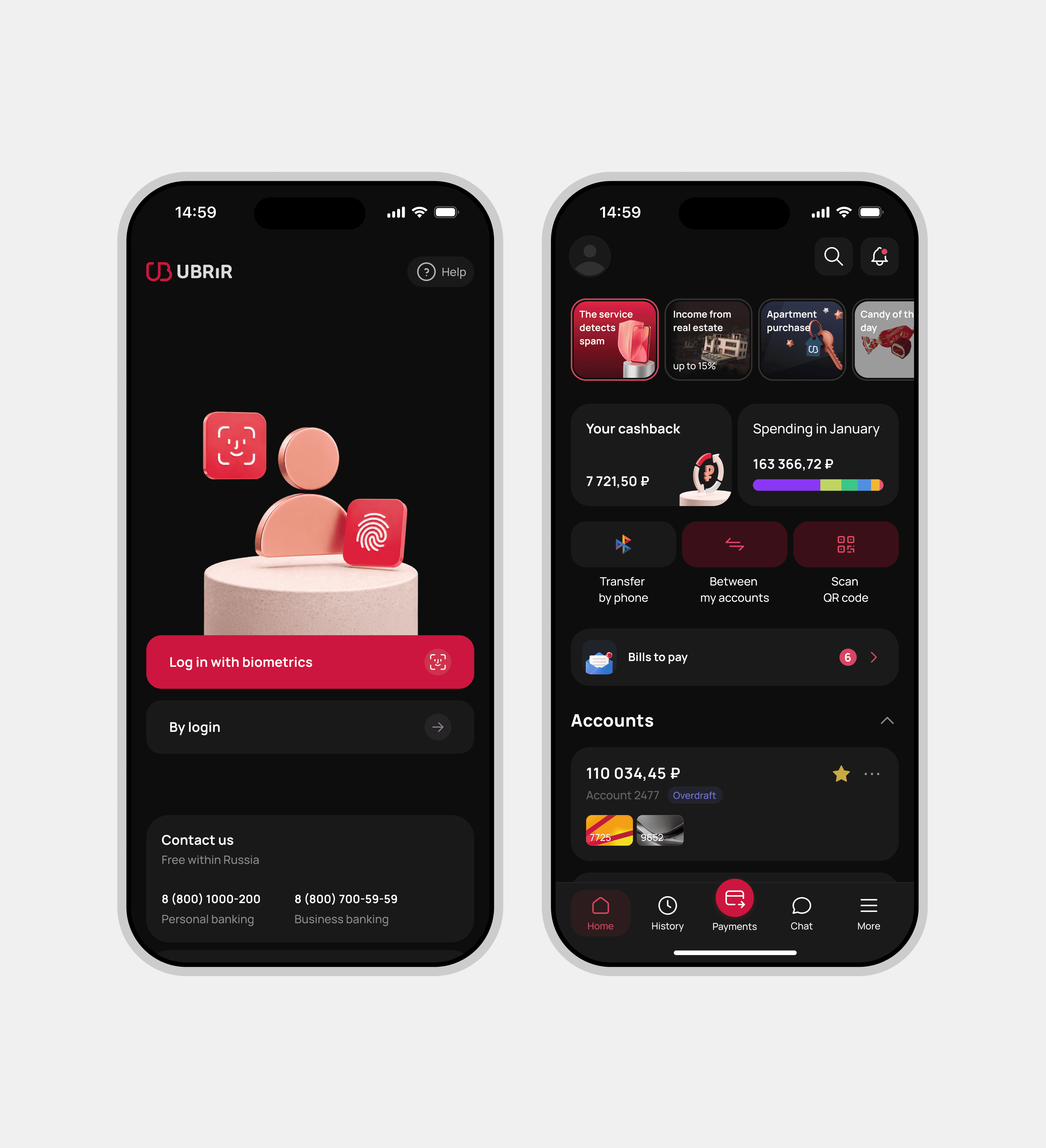
We began redesigning the online banking platform by starting with the home page, transforming it into a user-friendly starting point for day-to-day banking transactions and defining the visual concept for the rest of the product’s sections


My role
I was responsible for the structure and visual design of the entire redesign; I defined the concept and structure of the new homepage and worked closely with the product manager to develop its product logic. In addition, I played a key role in creating the design system for the redesign and, together with other designers, worked out the states and edge cases for key scenarios
Problem
The home page displayed account balances and cashback amounts, but offered almost no way to act on that information. Payments, transfers, recent transactions, cashback offers, and discounts were buried elsewhere in the product
Usage data and user feedback showed that customers expected quick access to these everyday tasks and services. Without it, the home page felt passive and made the entire online banking experience seem less useful
Solution and final design
Rather than focusing solely on a visual refresh, I identified several structural issues with the homepage, including limited functionality, an unclear hierarchy, and poorly defined product entry points
Quick actions shortened the path to frequent banking scenarios
Financial widgets made balances, accounts, and products easier to scan
Stories created a lightweight channel for updates and personalized offers
Cashback and discounts received a dedicated section, making benefits more visible
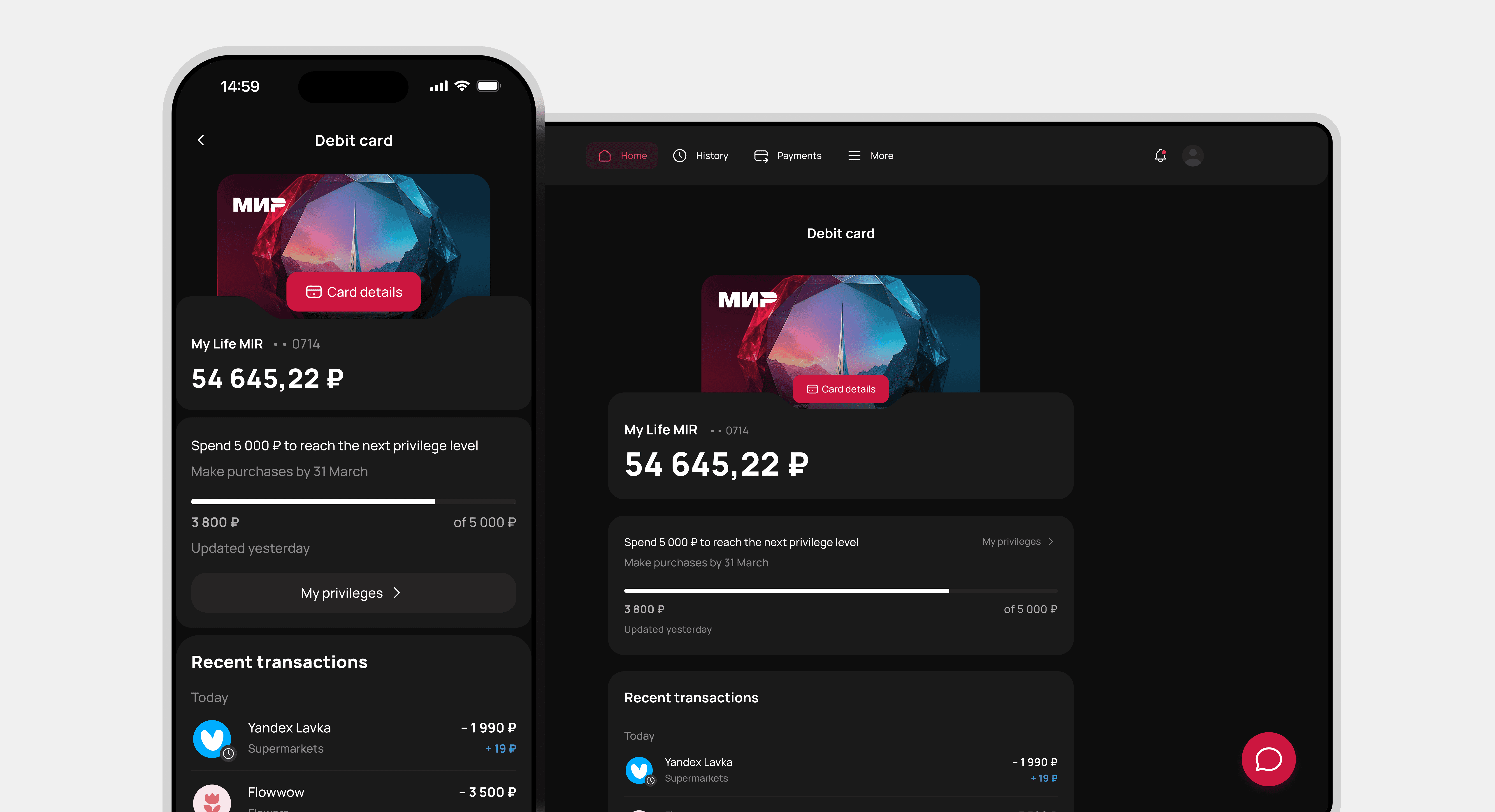
Recent transactions gave users an immediate overview of their activity
Product offers were integrated into the page without dominating the core banking experience
We redesigned the home page as a banking hub that brings key information and everyday actions together in one place
At the same time, the redesign was based on a new design system: components, states and visual guidelines became more consistent, meaning the new style could be scaled not only to the home page, but also to the registration page, sections and future scenarios
Key improvements
Users can now access transfers, payments, and other key banking features directly from the homepage, reducing the number of steps needed to complete common tasks
What has changed
Added quick access to the five most frequently used banking actions. The hypothesis was based on usage data and validated through usability testing: 5 out of 6 users found the target action without assistance
Brought recent transactions directly to the home page, reducing the journey from three steps to one
Created dedicated sections for cashback and discounts, making offers easier to discover
Added Stories as a flexible format for product updates and customer communication
Introduced a unified visual language and reusable components


How we validated the solution
5 out of 6 users completed the key task without assistance
38% faster average task completion time, from 68 to 42 seconds
43% fewer steps in the main user journey, reduced from 7 to 4
9 out of 11 issues identified during testing and stakeholder reviews were resolved before launch
12% increase in successful task completion after launch
Results
+13 percentage points in user retention
Three months after launch, user retention across desktop and mobile web increased by 13 percentage points
+21% more feature suggestions
The number of feature requests submitted through support increased by 21%, suggesting that users were more engaged and willing to help shape the product
Method: usability testing with six participants. Post-launch metrics compare the first three months after release with the previous experience


How the team’s work changed
Before the redesign, similar pages were created independently, interface patterns varied, and designers and product teams aligned late in the process
After the redesign, the team introduced:
shared page-building principles
a library of 42 reusable components
weekly reviews with designers and product teams
one consistent visual system, later adopted across three other areas of the online bank
Key takeaway
Starting from scratch allowed us to rebuild not only the interface, but also the way the team worked. Instead of continuing to patch an inconsistent system, we created a shared design process and a scalable foundation for future product development
