UBRiR
2025

My role
I designed the core system architecture, including semantic color tokens, the icon library, component structure, documentation, and component pages. I worked alongside product designers and developers, so the system grew from real banking flows rather than hypothetical use cases
Context and trigger
The bank was preparing to redesign several web banking journeys at the same time. However, the existing UI library had grown through years of local fixes and was already slowing the teams down
Every new screen required designers to find the latest component, check whether its states were complete, and either adapt it or create another version. Continuing with the old library would have brought the same problems into the redesigned product
The redesign created a practical moment to build a new foundation: new journeys already required new components, so creating them within one system prevented the team from redesigning the same patterns twice
Problem
The team had no reliable source of truth for the interface
Similar components had different states and behavior across product areas
Icons used different sizes, stroke weights, and visual styles
Colors were stored as visual styles without clear semantic roles
Components were scattered across files and difficult to find
Design and code no longer matched, forcing developers to recreate states manually
Documentation was incomplete or missing
As the product grew, designers and developers spent more time checking and adapting existing patterns than solving new product problems


Solution and final design
Instead of pausing product development for a complete rebuild, we created the new design system alongside the redesign and migrated the product journey by journey. Existing screens remained stable, while every redesigned flow used the new foundation
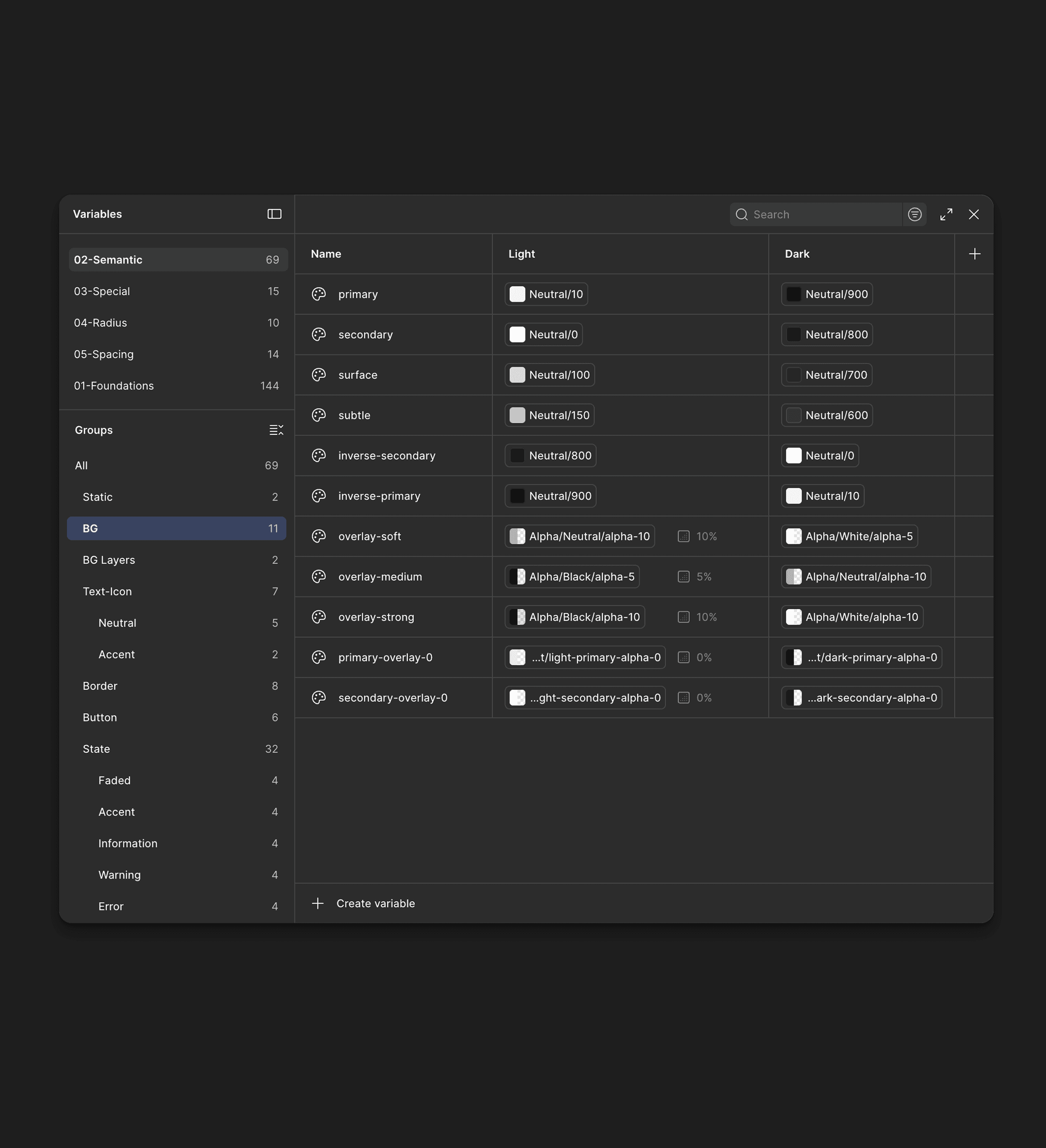
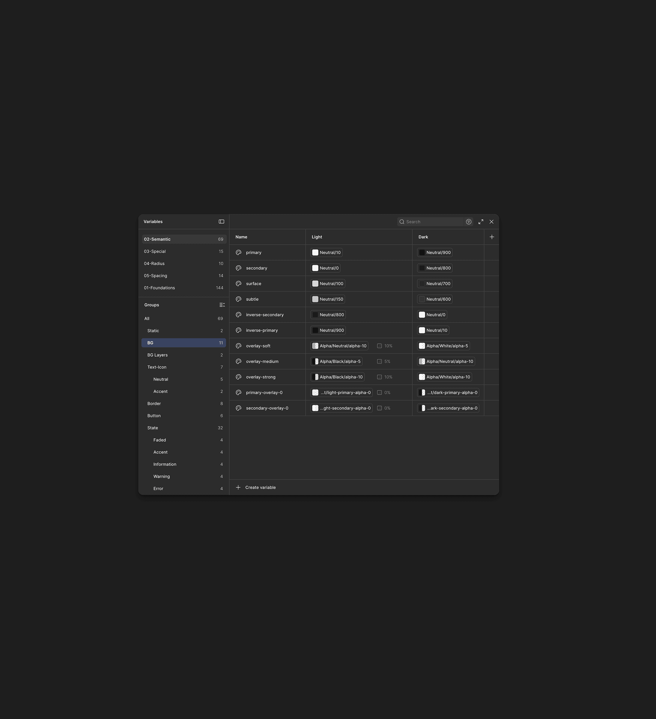
Semantic color system: replaced raw color styles with tokens organized by purpose, including backgrounds, text, controls, accents, and interface states
Theme support: introduced a shared color architecture that allowed designers to switch between light and dark themes without rebuilding components
Unified icon library: replaced several competing icon styles with one consistent set and clear sizing rules
Reusable component architecture: standardized component properties, variants, states, and behavior across the product
Structured documentation: organized components into dedicated pages with usage guidance, examples, and design rules
Design-to-code connection: aligned Figma components with their code equivalents, making component names, properties, and expected behavior clearer during handoff
Over time, the library grew to more than 1,000 reusable components, variants, and states, covering the main web banking journeys




How we built and rolled it out
We started by auditing the old library and more than 200 product screens. The audit revealed duplicated components, missing states, inconsistent naming, and patterns that looked similar but behaved differently
Instead of migrating the entire product at once, we used the active redesign as a gradual migration path. Each new flow followed the same process:
Identify the patterns required by the product flow
Reuse or extend an existing component where possible
Cover all required states and edge cases
Review the behavior with designers and developers
Document and release the component into the shared library
Components were created from real product needs rather than in isolation. This meant accounting for banking-specific states such as processing, partial success, insufficient funds, blocked accounts, empty states, and system errors
The design system evolved in parallel with product development. Designers and developers reviewed new components together, aligned names and properties between Figma and code, and resolved implementation constraints before patterns entered the shared library
This made the handoff clearer and helped keep the design and coded versions of components in sync
Migrated gradually
Existing screens remained untouched until their flows were redesigned. This allowed the team to introduce the new system without pausing product development or rebuilding the entire online bank at once


Results
80% component reuse
Around 80% of new screens could be assembled from existing components and patterns
35% faster design work
The average time needed to design and prepare a new product flow decreased by approximately 35%
60% fewer duplicates
Consolidating similar patterns reduced the number of duplicated components across design files by around 60%
2 weeks → 1 week
Clear component pages and usage documentation shortened onboarding for new designers from roughly two weeks to one week
1,000+ reusable assets
The library grew to more than 1,000 components, variants, and documented states covering the main banking journeys
Theme updates in minutes
Semantic tokens replaced manual screen-by-screen color updates, allowing themes to be changed across the whole product in a few minutes
Method: estimates based on an audit of more than 200 product screens and a comparison
of similar product flows before and after the new design system was introduced


